Skip to content

FFT

Brand refresh to affirm local values

Connecting the client to the target audience through alignment with shared local values and symbols.

Get in touch
FFT

The brief

The client wanted to retain their existing logo while expanding and strengthening their brand identity. With over 40 years of experience and strong roots in Manchester, more of this connection needed to be apparent in the brand to ensure the firm would resonate with its target audience. However, the success of the brand so far made it clear that a full rebrand was unnecessary and that a refresh would be the better option. This needed to focus on building a clearer identity, adding depth to the narrative and celebrating the heritage and expertise that set FFT apart.

The problem

The client’s existing brand lacked a strong, distinctive identity. While they wanted to retain their established logo and core colour palette of orange and grey, there was an opportunity to build a more memorable brand around these existing assets. The refresh focused on creating a stronger sense of personality and purpose, drawing on FFT’s rich heritage, expertise and Manchester roots. Rather than starting from scratch, the aim was to evolve the brand by introducing a clearer narrative, more consistent visual language and a stronger emotional connection with its audience. This approach allowed the business to preserve the recognition and equity built into the existing logo while creating a more modern, confident and distinctive identity that better reflects FFT’s position and reputation within the industry.

The approach

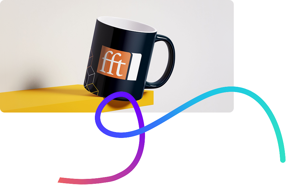
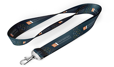
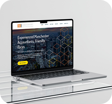
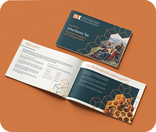
Our experts started by looking at what the client already had that was working and that the client wanted to keep and see how value could be added. As the client was based in Manchester, our team looked into the history of the area and discovered the importance of industry. We selected a library of images that show modern and historical Manchester. This influenced the creation of the colour palette, as the names given represented the area. Upon discovering the worker bee was the symbol of Manchester, a cube pattern was created that could be used in many ways throughout many platforms and in the client’s marketing collateral.

The results

Freedman Frankl & Taylor

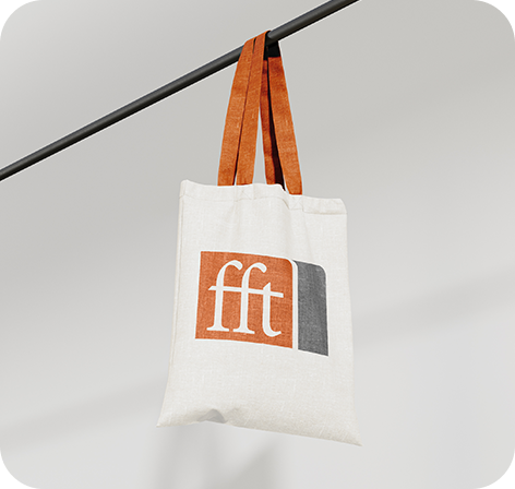
A unified brand story that was more closely connected to the area in which the client works and where the majority of their audience would reside. This tied in the history of the firm with that of the local area and provided consistency across all marketing assets.

Freedman Frankl & Taylor